Photo Credit: TailorBrands.com
What makes a great logo? A logo is a central part of any business’s branding, as it’s usually the first point of contact for most potential customers.
That’s why it’s vital to make sure that when you make a logo, it truly represents your brand and can connect with consumers.
There are several aspects that go into logo design, and they may change depending on your needs and the industry you operate in. Even so, the best logos all share 5 major characteristics, no matter the differences that make them unique.

So, what makes a good logo? A good logo is:
- Simple
- Relevant
- Memorable
- Timeless
- Versatile
These 5 qualities make a logo instantly identifiable. Qualities that ensure that when customers look at it, they’ll connect with your brand.
Continue on to learn more about what goes into making a good logo on your own.
5 Characteristics of a Good Logo:
1. Simple
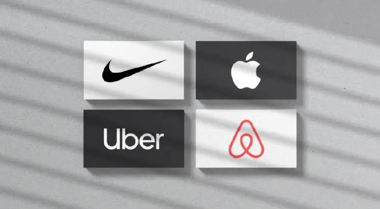
Many of the most impactful and successful logos in history are surprisingly simple. From Nike’s single swoosh to Apple’s eponymous design, simple logos are easy to recognize and remember. Simplicity is a key ingredient for logos because most consumers only focus on a logo for a short time. A simple design can express your brand’s personality concisely and effectively.
Simple logos focus on highlighting the most important parts of a brand’s personality with limited real estate. This includes focusing more on aspects like colors and fonts as well as on distilling ideas into their simplest form. For instance, a symbol is a powerful way of creating simplicity. It can instill a mental association with a particular set of values or ideas.
Other great designs for a simple logo include letter and word marks. They dispense with images and focus instead on communicating brand personality directly with fonts and colors. Overall, the most important aspect is to focus on using as few elements as possible to communicate your brand’s identity.
2. Relevant
The first quality great logos share is that they’re relevant to the markets their companies target. More importantly, they clearly communicate a brand’s personality and identity. A primary component is the use of colors in your logo, which can trigger different emotions and show your brand’s personality to consumers. A company that sells toys for children may choose bright colors that communicate energy, fun, and excitement.
The second important component is the font used in the logo or word mark. Fonts help communicate your brand’s tone and its values, which ultimately help define your personality better. More angular and thin fonts are ideal for highlighting a company that works in technology while softer cursives are excellent for companies that work in jewelry or women’s products.
Finally, choosing the right symbol is a key aspect of establishing a visual anchor for your logo. Symbols are important aspects of a logo because they can be used by themselves as a simpler version of your logo. Symbols are also important when building connections between your brand and the ideas and values behind it. Great logo design indeed.
3. Memorable
Another key aspect of a good logo is that it is memorable, even from the first time you see it. The goal of a logo is to create a connection with a consumer and generate interest in your brand. When consumers can easily recall your logo and brand, they are more likely to connect them with your company. Logos that are easy to remember and produce a strong impact are valuable because they help your brand stick in consumers’ minds.
Memorable logos combine many of the elements discussed above, but they find the right balance between the visual and textual aspects. More importantly, they clearly and cohesively communicate your brand’s personality and tone.
Finally, a memorable logo should always strive to be unique. Even in industries where there are standards and common norms for designs, your logo should always aim to stand out from the pack as much as possible. Truly, great logo design.
4. Timeless
The best logos stand out from the pack because they remain relevant and effective over the years. It’s always tempting when you design a logo that incorporates current design trends and fads, but it’s not always the best decision.
These logos may look good now, but they will probably need to be redesigned later to keep them current. Instead, a timeless logo is one that will remain relevant and connect with users no matter when it is being used. For instance, McDonald’s golden arches have remained unchanged for decades, as has Coca-Cola’s iconic word mark.
Timeless logos focus on quality over quantity, removing many of the unnecessary elements and crazy ideas and focusing on what works. This means focusing exclusively on your brand’s core ideas and values to uncover the most effective way to transmit them without unnecessary clutter. Another important aspect of timeless logos is that they keep colors simple and basic, ignoring gradients and massive palettes in favor of more selective and unique colors.
Finally, a memorable logo should always strive to be unique. Even in industries where there are standards and common norms for designs, your logo should always aim to stand out from the pack as much as possible.
5. Versatile
Last, but certainly not least, a good logo can be used in a variety of ways, shapes, and situations. For example, a logo you can only use in one size online is not very good, as it limits the ways you can expose your brand to the world. On the other hand, choosing a logo that can be resized, printed, or placed on different media makes your brand significantly more visible.
Even the best-looking logos are not necessarily good if they become illegible or unrecognizable when you shrink them for packaging or become distorted when you put them on a billboard. One of the easiest ways to make your logo more versatile is to think about what format you create and save it in. Traditional photo images may pixelate when you resize them, but vector files are built to be scaled.
On a design level, keeping the clutter to a minimum and opting for a simple design will instantly make your logo more versatile. Having too many lines, flourishes, elements, or colors can create a complicated design that will scale poorly. Instead, keep in mind that you have limited real estate, and focus on saying more with less.
Over to You

Good logos are easy to design when you focus on the qualities that make them effective. By working to produce a timeless yet versatile design, you can establish a strong foundation to build your brand upon.
Making it simple will also help it be more memorable for the audience. Ensure that your design is more relevant. With a good logo in hand, you can start creating an impactful brand.Doing so will catch consumers’ eyes. Thus keeping you on their minds for a long time.
For SEO improvement click here: SEO


